From Consumer Understanding to Product Leadership
At Whirlpool, consumer understanding became a way to guide product decisions across appliances, categories, and markets. The work translated everyday behaviors into usability, ergonomics, interface decisions, product language, and development priorities for cooking, refrigeration, and laundry.
This case shows how a design team can turn research, product development, and manufacturing constraints into appliances that are easier to use, easier to recognize, and stronger in the market.
A Design Operation Built to Move Ideas into Production
From insight to concept, validation, and production.

This structure turned design into an operating capability: a way to guide product decisions from early vision to validated, production-ready solutions.
Creating Product Consistency Across Categories
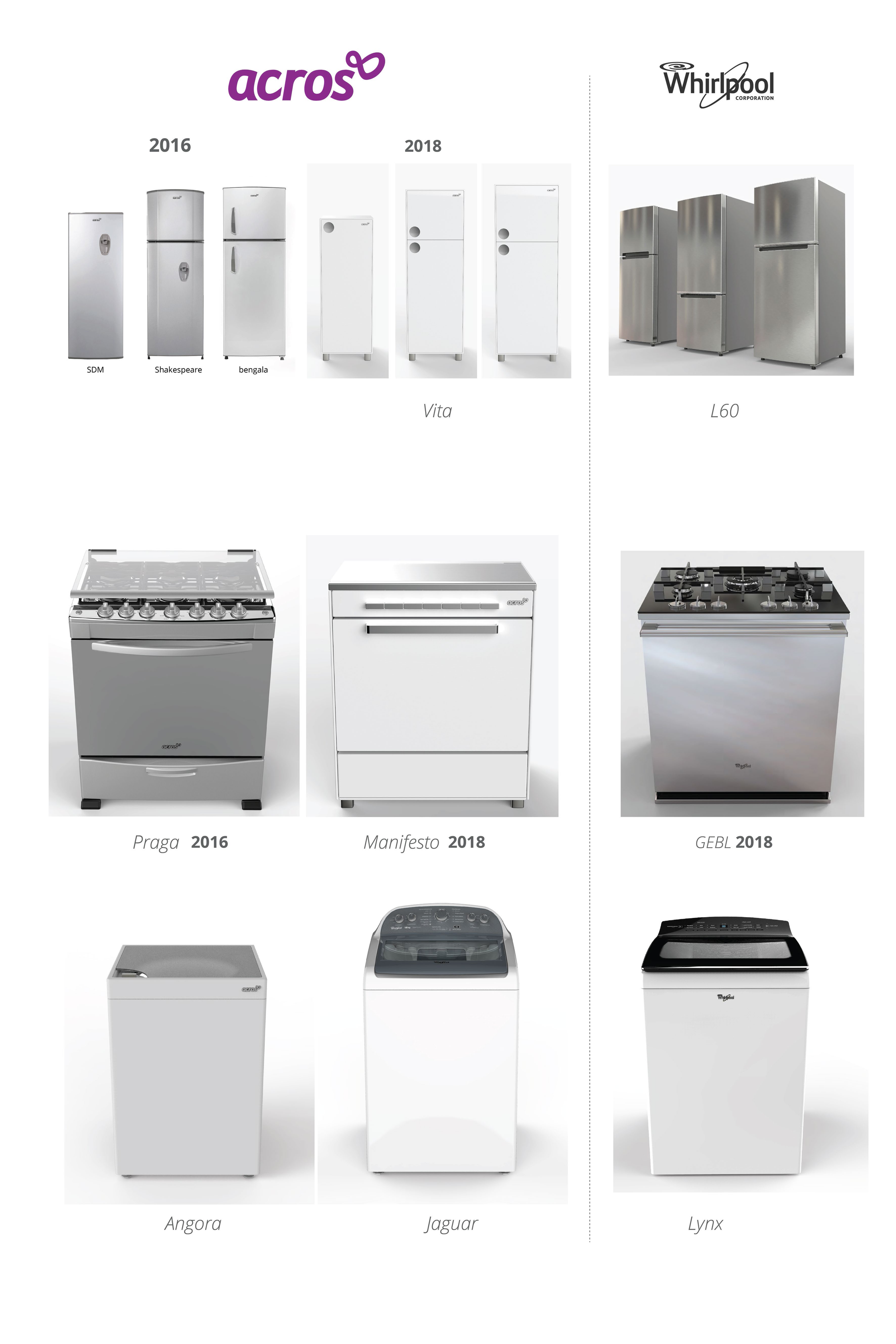
The Acros work shows how a brand can become more coherent through product decisions: color, materials, finishes, controls, graphics, proportions, and details working together across different appliances.
The goal was not only visual consistency, but a clearer product language that helped the portfolio feel more recognizable, easier to navigate, and better aligned with consumer expectations.


Building Identity Within Cost Constraints
Acros needed a stronger identity across a broad appliance lineup, but the brand worked in a highly cost-sensitive segment where major tooling changes were difficult to justify.
The approach was to define a clear direction for what the brand could become, and then look for affordable ways to move the portfolio toward that vision: color, finishes, graphics, textures, surface treatments, and details that could be applied without redesigning every product from scratch.
This created a practical design language for renewal: small decisions that made the products feel more recognizable, more contemporary, and easier to update over time.
Color, Fashion, and Replaceable Components
In laundry, the strategy used fashion-inspired color palettes and replaceable components to refresh the lineup over time. Because exact color matching across materials and suppliers can be expensive, the system allowed different tones to work together as a coordinated palette instead of forcing a single perfect match.

Designing Appliance Interfaces Around Real Use
Physical interfaces leave little room for correction once they reach production. Buttons, labels, displays, handles, reach, sequence, and graphic hierarchy have to be clear before the product is manufactured.
At GCD Mexico, usability and ergonomic studies helped evaluate how people read panels, locate controls, open doors, and operate appliances in real conditions. Observation rooms, cold-room tests, and physical prototypes made it possible to see where users hesitated, reached naturally, or misunderstood an interaction.
This validation work also supported programs for other regions, turning Mexico into a practical place to test product decisions before they moved into production.
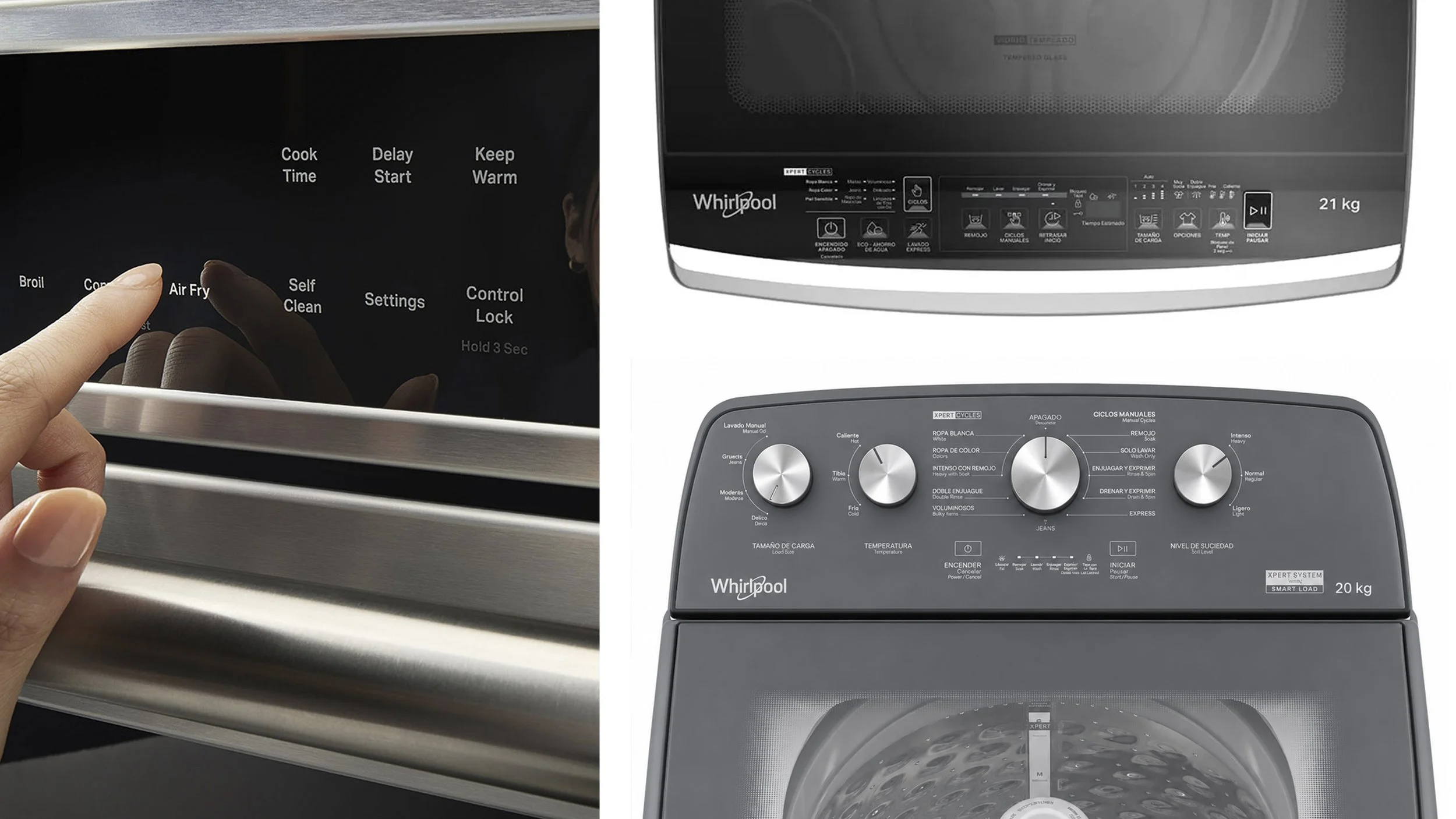
Interface, control, and ergonomics validation across cooking and laundry appliances.
Making Capacity Visible
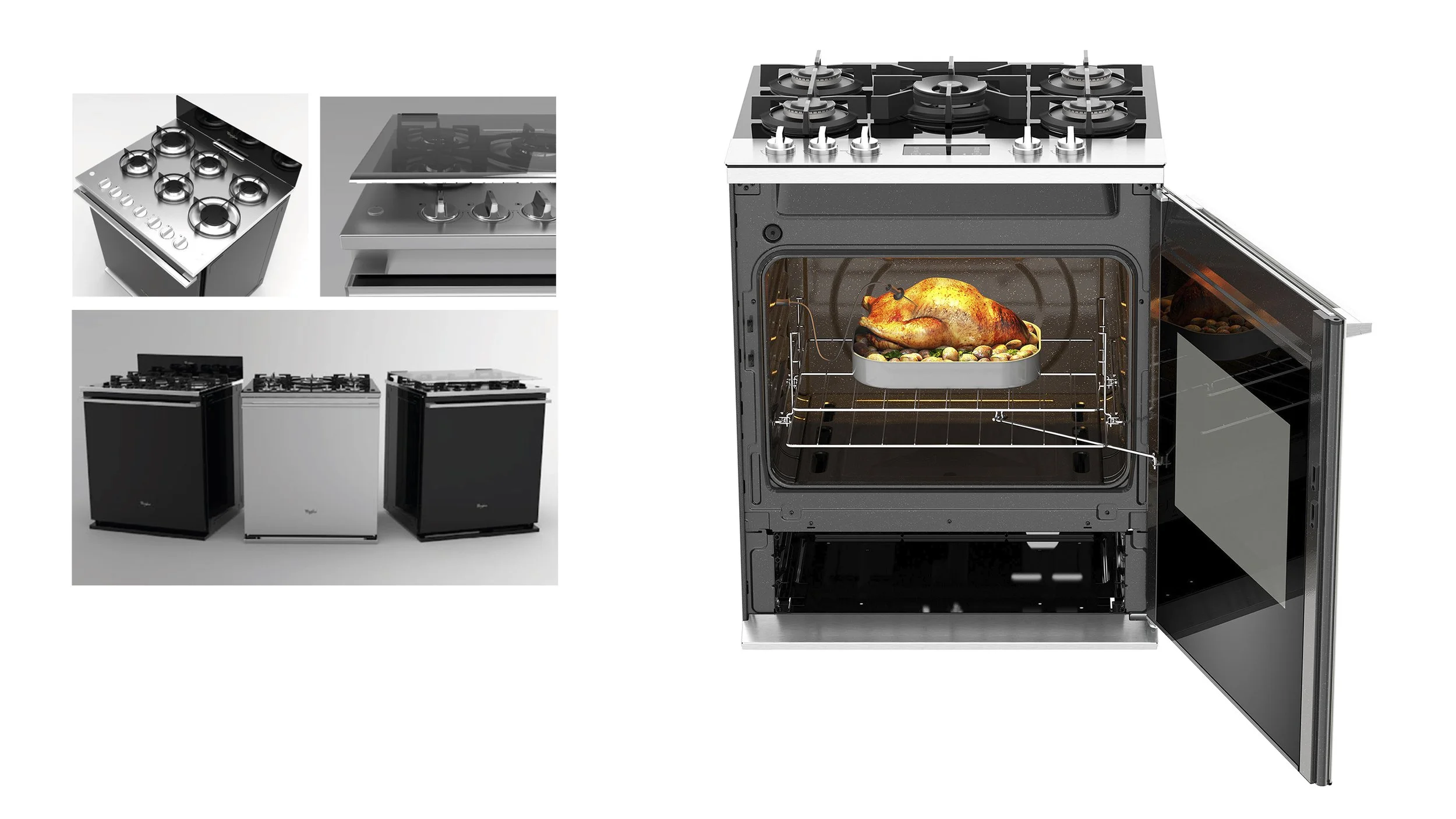
Market research showed that oven capacity was one of the most important purchase drivers in the category. The design opportunity was to make the product feel more spacious and capable without requiring a full redesign of the oven cavity.
The side-swing full door changed the way users perceived the appliance. By extending the door visually across the front of the range, the oven cavity appeared larger, easier to access, and more generous in use.
The concept was repeatedly validated in market research, became an influential product direction, and was recognized with an iF Design Award.
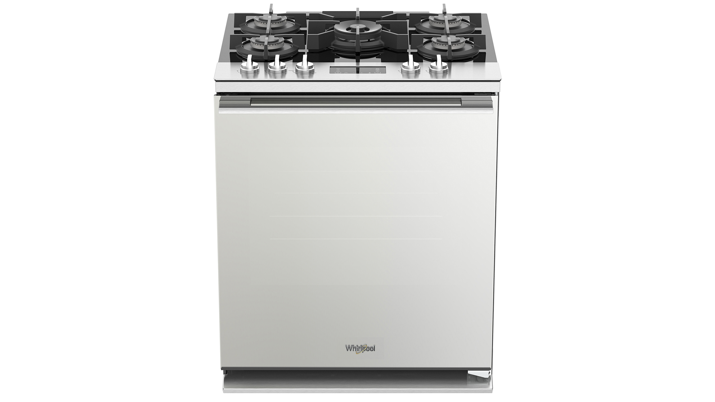
Side-swing full oven door
Designed around perceived capacity
Top preference in market research
Influenced global product direction
iF Design Award winner
Strong category performer

A Regional Design Direction With Global Influence
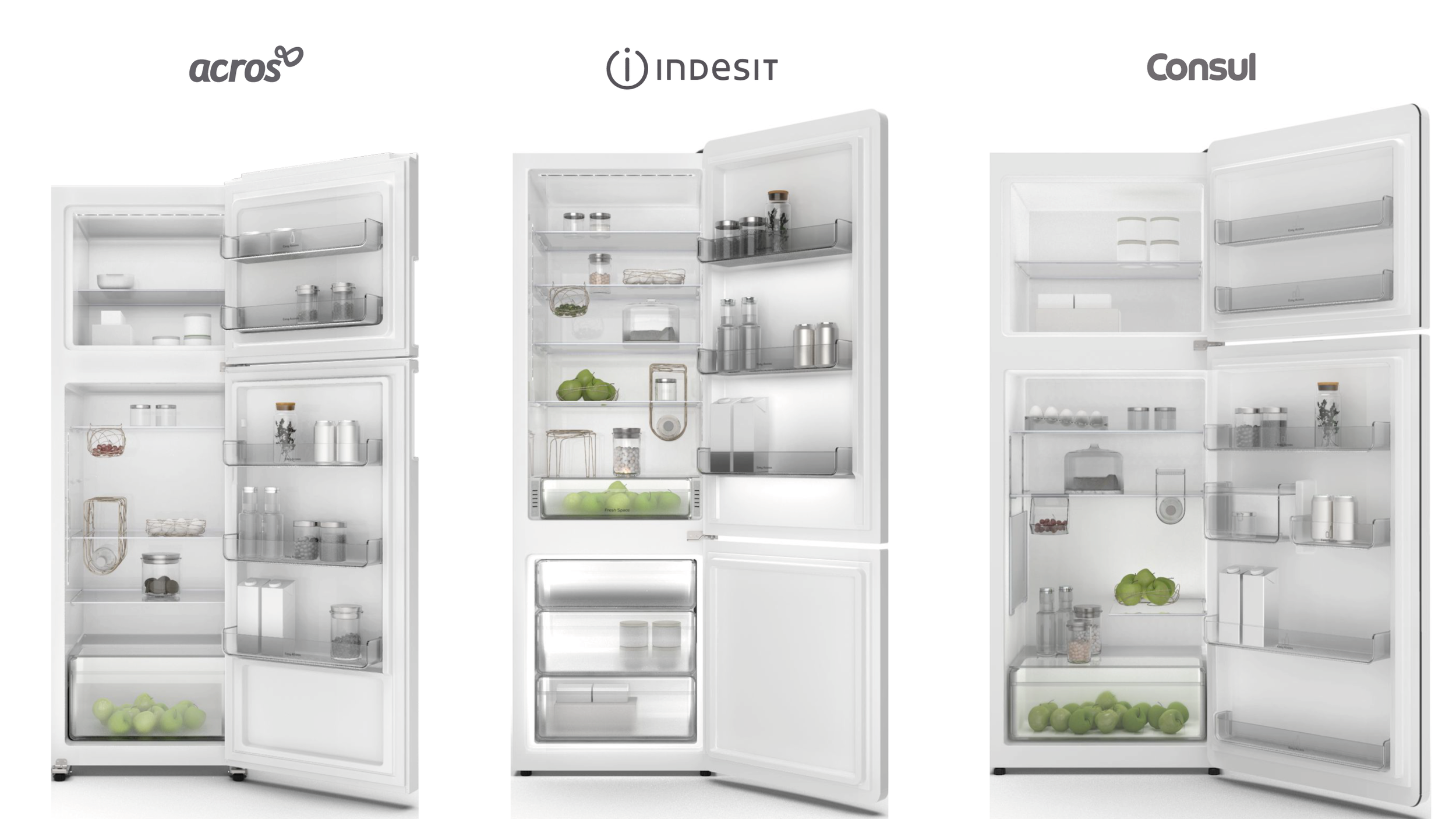
This work became part of a broader design conversation across Acros, Consul, and Indesit. Each brand had different markets and price points, but shared the same challenge: building stronger identity without adding unnecessary cost.
The selected direction connected brand personality, materials, finishes, graphics, controls, and product details into a language that could travel across regions and still feel relevant to local consumers.


Shared design elements allowed the brands to build consistency while preserving their own character.


Reframing Refrigeration Around Everyday Use
In refrigeration, the work focused on how people organize, see, reach, and use food every day. Interior architecture, shelves, containers, lighting, and access points were treated as experience decisions, not only as technical components.
The goal was to make the inside of the appliance feel clearer, more useful, and more desirable at the moment people interact with it most.

Making Design Visible Across the Organization
The product work was supported by a design operation built for execution: research, product development, prototyping, model making, photography, studio engineering, and cross-functional collaboration.
GCD Mexico also helped make design more visible inside the company through studios, showrooms, shared spaces, and internal environments where teams could review, test, discuss, and improve ideas together.


Design reviews and workshops helped align teams around consumer needs, product direction, and business priorities.

Selected exploratory work is available in a private walkthrough.